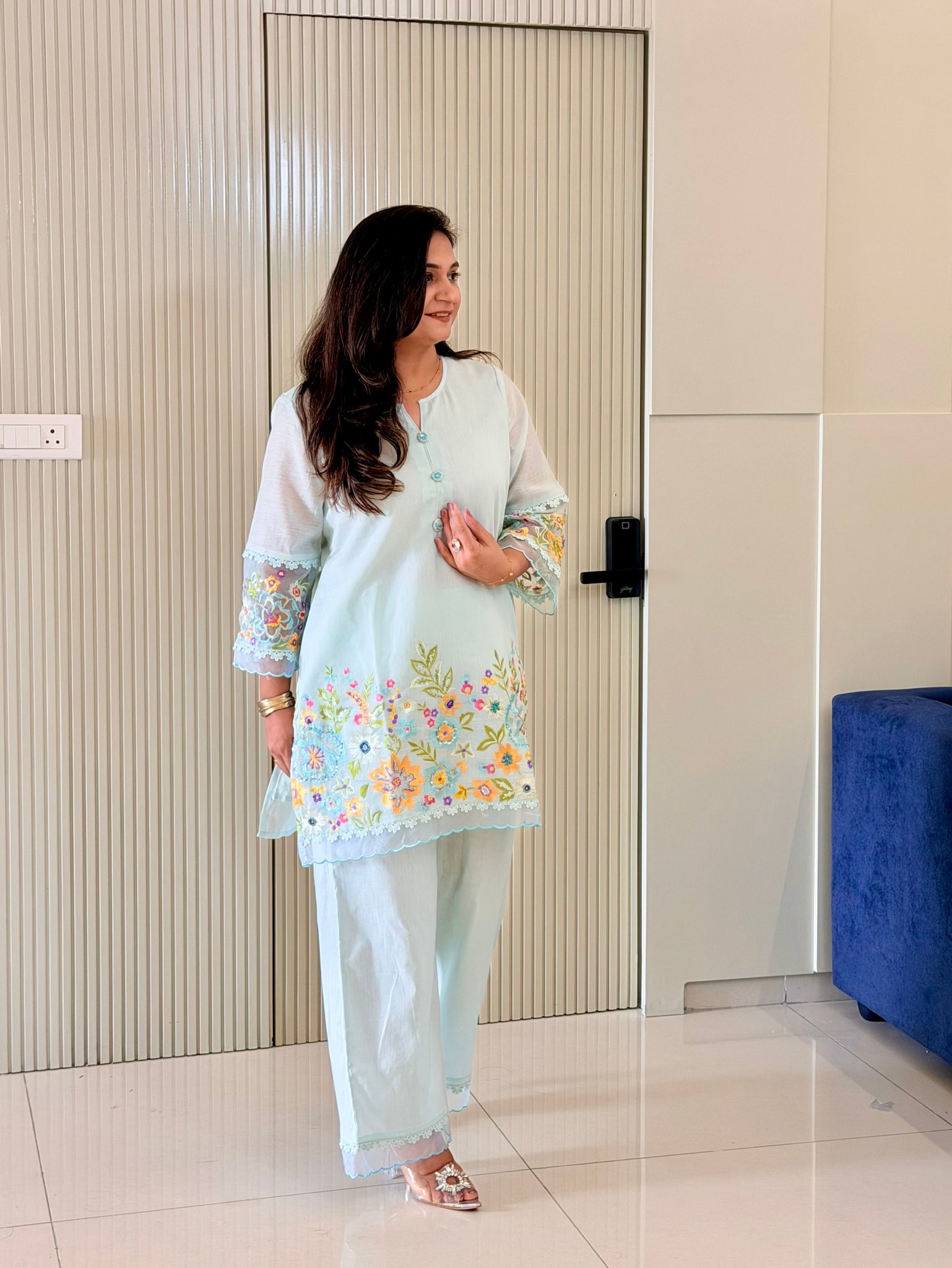
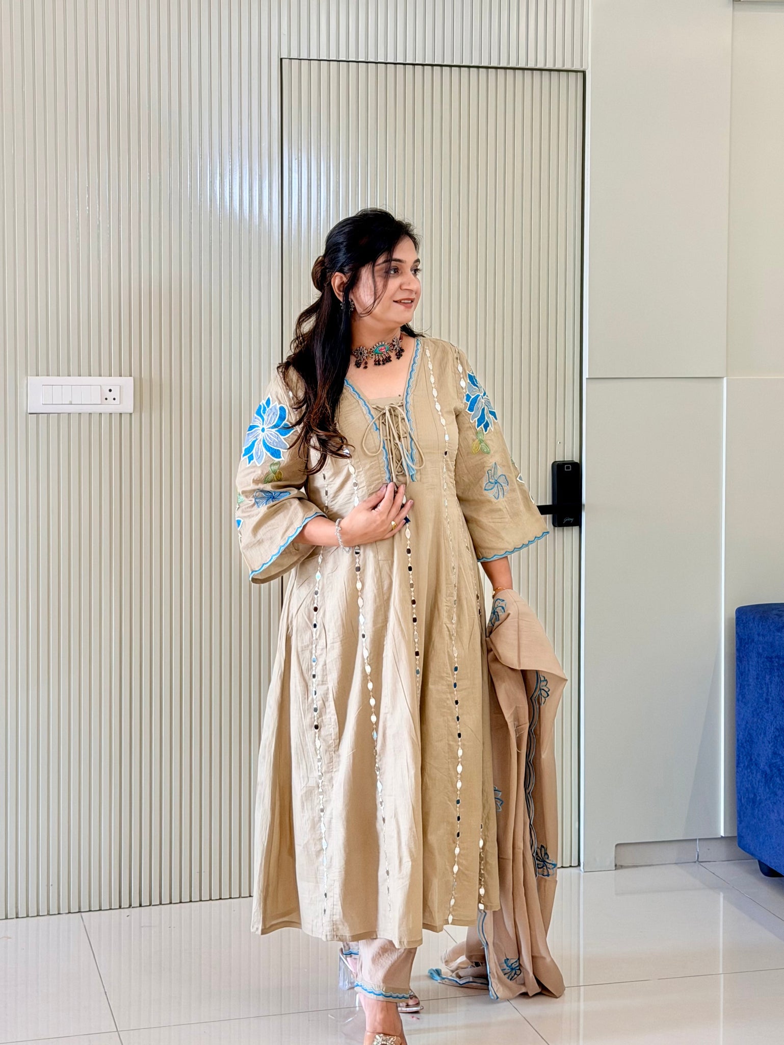
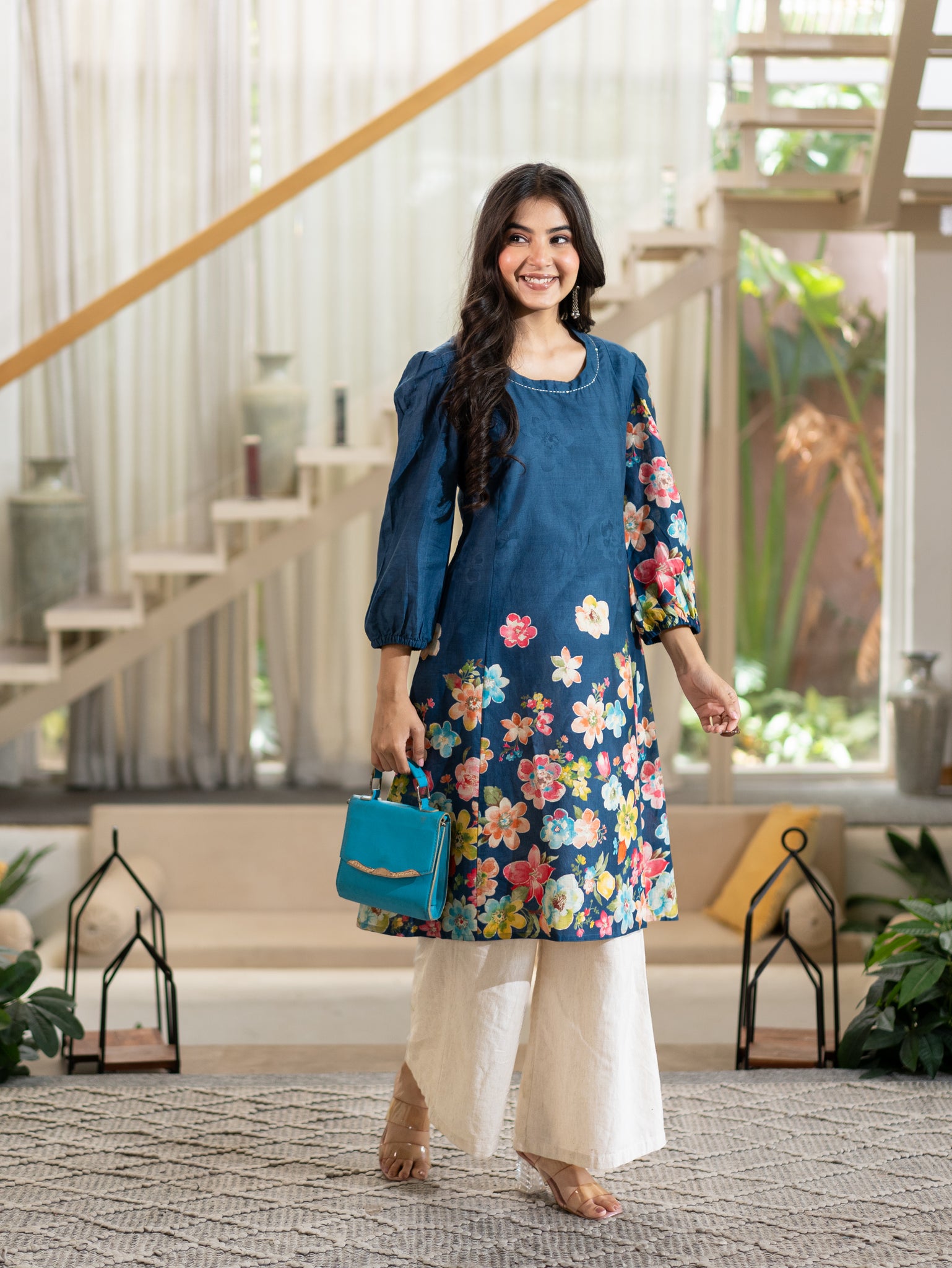
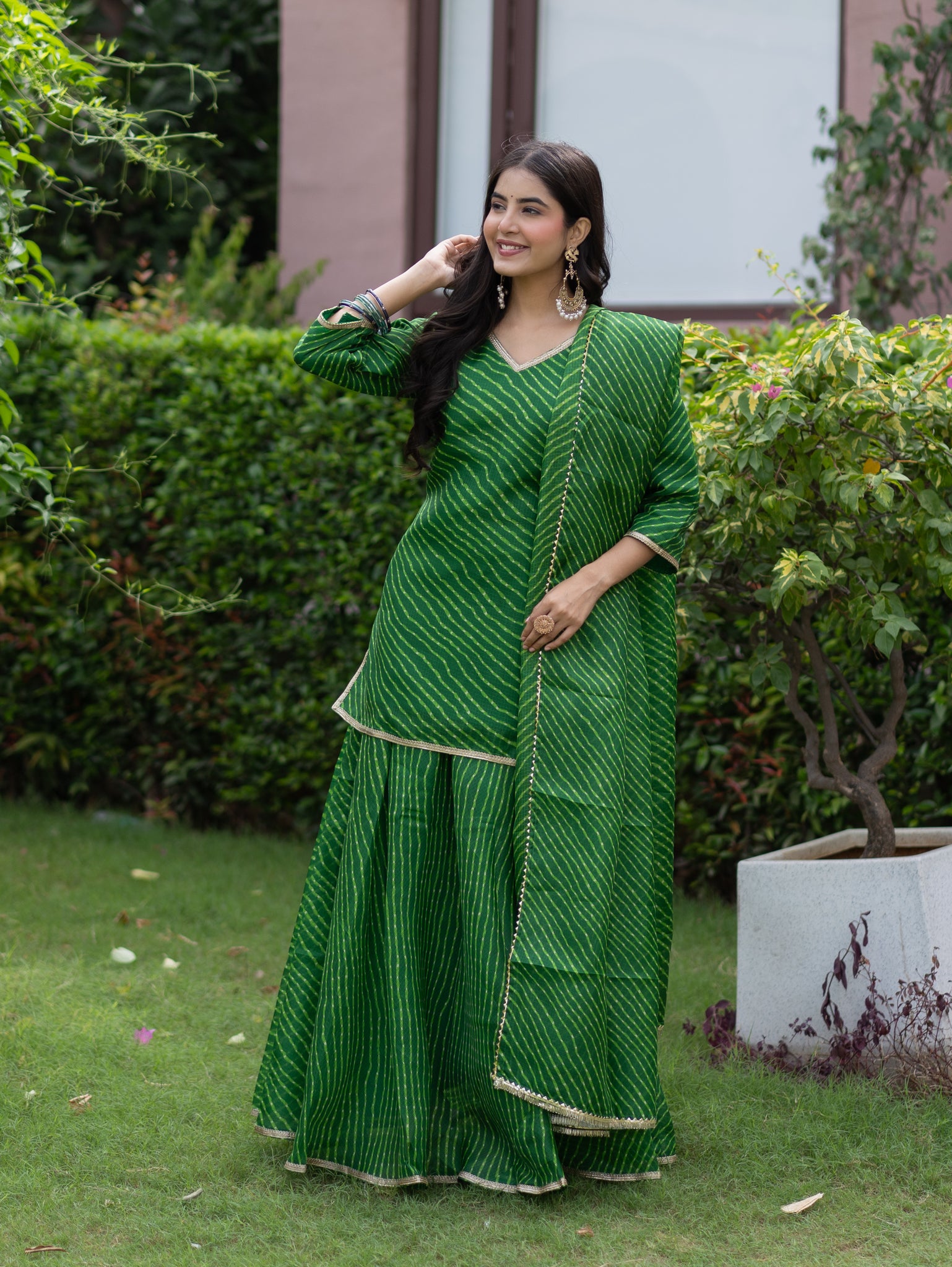
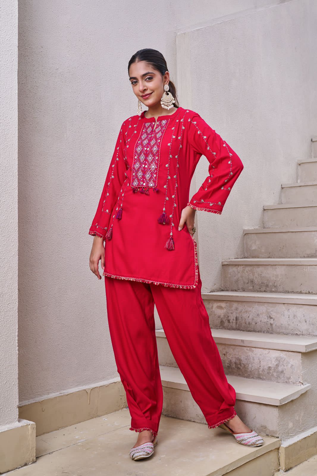
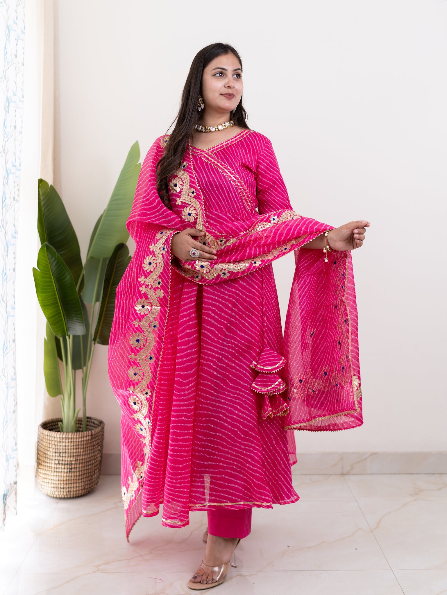
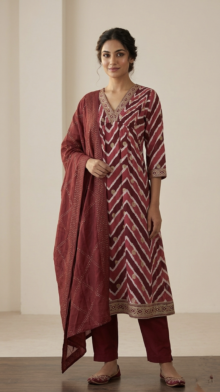
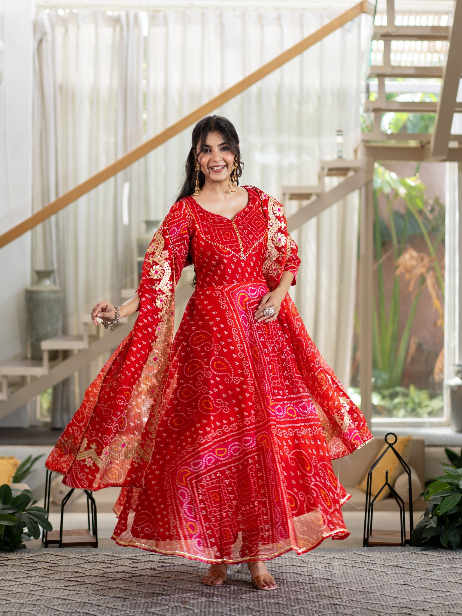
Choosing a kurta is not only about its design, fabric, or embroidery. Colour plays an important role in how an outfit looks on you. A shade that makes one person’s complexion look fresh may make another person look dull or washed out.
Understanding your skin tone and undertone can make choosing a kurta colour much easier. Instead of selecting shades only because they look attractive on a hanger or mannequin, you can choose colours that naturally complement your complexion.
Whether you are looking for an everyday cotton kurta, a festive kurta set, or an outfit for a family gathering, the right colour can make your entire look feel more balanced.
Skin Tone and Undertone: What Is the Difference?
Your skin tone is the visible colour of your skin, while your undertone is the subtle colour underneath the surface. Skin tones can broadly range from fair to medium or dusky to deep, while undertones are generally warm, cool, or neutral.
Two people can have a similar skin tone but different undertones. That is why the same colour kurta may look completely different on them.
You can get an idea of your undertone by checking your wrist veins in natural light. Green-looking veins often indicate warm undertones, while blue or purple veins may indicate cool undertones. If you see a mix of both, you may have a neutral undertone.
Why does skin tone matter to select a Kurta?
Makes your complexion look brighter: The right colour can bring out your natural glow and make your face look fresher.
Creates better contrast: A well-matched shade adds definition to your overall look instead of blending too closely with your skin.
Helps you choose colours confidently: Understanding your skin tone and undertone makes it easier to narrow down shades that suit you.
Improves the overall outfit: When the kurta colour complements your complexion, your jewellery, dupatta, and other details can look more balanced.
Makes shopping easier: Knowing which colour families work for you reduces guesswork when choosing a new kurta or kurta set.
Kurta Colours That Suit Fair Skin
Fair skin gives you plenty of options, from soft pastels to deeper shades that create contrast.
Colours such as navy, emerald green, royal blue, maroon, burgundy, and plum can add definition to fair complexions. If you prefer warmer shades, mustard, rust, terracotta, and coral can bring warmth to your look.
Pastels such as peach, blush pink, and lavender can also work well, particularly when paired with a deeper dupatta or contrasting detailing.
Try these combinations:
-
Navy kurta with a beige or gold-toned dupatta
-
Emerald green with subtle gold detailing
-
Maroon with cream accents
-
Mustard with deep green
-
Plum with a contrasting dupatta
Very pale cream or beige may sometimes blend into fair skin. If you like these shades, introduce contrast through embroidery, jewellery, or your dupatta.
Kurta Colours for Dusky or Medium Skin
Medium and dusky complexions can carry a wide variety of colours. Shades with warmth and depth often create an attractive contrast.
For everyday dressing, consider mustard, olive, terracotta, rust, coral, teal, camel, and warm brown. For festive occasions, richer colours such as wine, maroon, forest green, cobalt blue, and deep teal can add more visual impact.
If you have warm undertones, earthy and golden shades may complement your complexion particularly well. Those with cooler undertones can experiment with jewel shades such as emerald, plum, cobalt, and indigo.
Some combinations to try:
-
Rust with forest green
-
Mustard with navy
-
Coral with beige
-
Teal with cream
-
Wine with gold accents
Very faded beige, flat grey, or extremely muted shades can sometimes make medium skin appear less defined. You can still wear them by adding a darker dupatta, border, or accessories.
Kurta Colours for Deep Skin Tones
Deep complexions can look particularly striking in colours with strong pigmentation and clear contrast.
Try royal blue, emerald green, magenta, bright red, saffron, mustard, orange, purple, teal, and bright yellow. White can also create a crisp contrast and works well for both everyday and festive outfits.
For a richer look, jewel tones such as sapphire, wine, and emerald can add depth without competing with your complexion.
Colour combinations worth trying:
-
Bright yellow with navy
-
Magenta with gold
-
Royal blue with white
-
Emerald green with beige
-
Saffron with maroon
Muddy khaki, dull grey, and flat brown may sometimes reduce contrast. If you like these colours, use them through prints, borders, or accessories instead of making them the dominant shade.
Choose Colours According to Your Undertone
Your skin tone gives you a broad starting point, while your undertone can help narrow your choices further.
Warm undertones generally work well with mustard, rust, terracotta, coral, olive, saffron, warm beige, and maroon.
Cool undertones often pair nicely with indigo, sapphire blue, emerald, lavender, plum, fuchsia, and cool pink.
Neutral undertones give you more flexibility. You can experiment with both warm and cool shades, including teal, peach, maroon, navy, rose, olive, and soft white.
These are useful guidelines rather than fixed rules. The shade that makes you feel confident should always have the final say.
Easy Kurti Colour Combinations
Finding one flattering colour is only half the job. Knowing how to pair it can make your complete outfit look more balanced.
For festive occasions, combinations such as maroon and beige, green and gold, mustard and navy, or magenta and cream work well.
For everyday wear, try peach and cream, blue and white, olive and beige, or pink and ivory.
A simple styling rule is to choose one dominant colour and use a second shade as support. If the kurta is bright or heavily printed, keep the dupatta and bottoms relatively simple. If the kurta is a soft neutral, use the dupatta or accessories to introduce contrast.
Fabric and Prints Can Change the Colour
The same shade can look different depending on the fabric. Matte fabrics such as cotton tend to give colours a softer appearance, while fabrics with more sheen can make them appear brighter or more intense.
Prints also influence how a colour kurti design looks. A solid maroon kurta creates a different effect from a heavily printed maroon kurta.
If you are trying a new colour, start with a solid or lightly printed design. Once you know the shade suits you, you can experiment with more detailed patterns.
Common Colour-Picking Mistakes
Do not choose a kurta only because the colour looks good on someone else. Your complexion and undertone can change how the same shade appears.
Also, do not completely reject a colour family because one shade did not work. If bright pink feels too strong, try rose or coral. If pale blue makes you look dull, try indigo or cobalt instead.
Most importantly, colour guidelines should help you make decisions, not restrict your personal style.
FAQs
Q. Which kurta colours suit fair skin?
Navy, emerald green, maroon, royal blue, plum, mustard, rust, and selected pastel shades can complement fair skin.
Q. What colours look good on dusky skin?
Mustard, rust, coral, teal, wine, maroon, olive, cobalt, and forest green are good options for dusky or medium complexions.
Q. Which colours suit deep skin tones?
Royal blue, emerald, magenta, red, mustard, saffron, orange, and bright yellow can create beautiful contrast with deep skin tones.
Q. Can darker skin tones wear pastel kurtas?
Yes. Choose warmer pastels or balance lighter colours with a deeper dupatta, border, jewellery, or accessories.
Q. How does undertone help with choosing a kurta colour?
Warm undertones generally suit earthy shades, cool undertones often work well with blue and jewel tones, while neutral undertones can experiment with both.
Final Thoughts
No single kurta colour suits every skin tone. Your skin tone, undertone, personal preference, occasion, fabric, and styling all influence how a shade looks on you.
At The Jaipur Studio, you can explore a variety of kurta colours, fabrics, and styles to find shades that complement your complexion and personal style. Start by identifying colours that make your complexion look fresh and balanced, then experiment with lighter, deeper, warmer, or cooler versions.
Once you understand what works for you, choosing your next kurta becomes less about guessing and more about finding colours that make you feel confident.